I never realized the different things you had to do in order for a piece to be properly prepared for printing. I learned about what indesign should be used for, and what it should not be used for. Example: do not re-size images in indesign, and make sure the file is properly saved. I also learned how to make sure the colors on your computer come out the same once printed. You should make sure everything is CMYK, and only use pantone colors. Overall, I learned a significant amount about printing, and I feel much more confident in preparing pieces for print.
One thing I wish we would have gone over more is the image master list, because that is an important part of the class. I also think the first project should be done for participation points, but graded as if it were a real project so the student knows what to do different.
Again, this was a great class and I feel a lot more prepared to be out in he real world.

Wednesday, December 14, 2011
Tuesday, December 13, 2011
Final Project
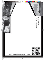
For my final project I created a 34x33 poster (front and back) that folds down into smaller sections. My target audience is photographers, both professional and non-professional; People with an interest in outdoor/nature photography. Target age is young to old, whoever is interested in photography.
Project Specs:
34 x 33, fully open
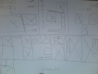
Horizontal fold lines at
~8", ~16", ~24"
Vertical fold lines at
8.5", 17", 25.5
.25 margin
.125 bleed
4-color
Price Quote for printing:
Completed final project:
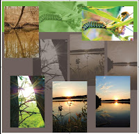
All of the images used on my project were taken by me and copyrighted to me.
Project Specs:
34 x 33, fully open
Horizontal fold lines at
~8", ~16", ~24"
Vertical fold lines at
8.5", 17", 25.5
.25 margin
.125 bleed
4-color
Price Quote for printing:
Completed final project:


All of the images used on my project were taken by me and copyrighted to me.
Tuesday, November 22, 2011
Full page publication ad
Thumbnails:

Rough:

Final:

My final ad remained consistent with my final rough. My target audience is photographers, or anybody interested in photography.

Rough:

Final:

My final ad remained consistent with my final rough. My target audience is photographers, or anybody interested in photography.
Saturday, October 29, 2011
Collegio ad project
Collegio ad thumbnails
Rough
My collegio ad focused on my photography, advertsing a gallery I have. My target audience is people aged 18 to 40, professional photographers or recreational photographers. My call to action is the e-mail address that I supplied.
Finished project
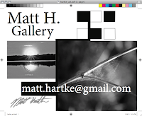
My finished project remained consistent with my final rough. I utilized my e-mail and signature to get my name out, and to use as my call for action.

Rough

My collegio ad focused on my photography, advertsing a gallery I have. My target audience is people aged 18 to 40, professional photographers or recreational photographers. My call to action is the e-mail address that I supplied.
Finished project

My finished project remained consistent with my final rough. I utilized my e-mail and signature to get my name out, and to use as my call for action.
Thursday, October 6, 2011
Variable Direct Mail
Rough Sketches:
I plan on advertising my photography business. I will send out 2 versions each with different picture from my collection.
My target audience is young adults to adults. Age 18 to 40. People who are into photography as a hobby, have professional experience with with photography, or have their own photography business. Male and female. Or any creative type looking for pictures to use, or have something of theirs captured by a professional photographer.
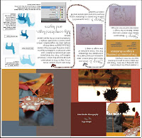
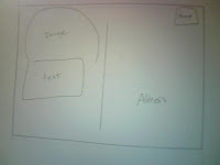
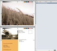
My final direct mail project included the following parameters: 7x5 inches, 2 sided direct mail post card with variable content. I used 3 images total, 2 were variable and one was static.
The 2 variable pictures included the fog/statues and wheat grass, the static image was the sunflower. The fog/statue photo included a blue photo scheme, while the wheat grass photo included a yellow color scheme.
My instruction sheet listed the color scheme , blue or yellow, and where it should be placed. Then I listed the photos and where on each mail piece it should be placed.
My database included the addresses and names of the individuals who are going to receive my mail piece. I then put the pantone color, and image name next to the appropriate individual.
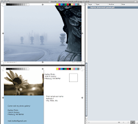
All images were taken by me, Matt Hartke, and are copyrighted to me.


I plan on advertising my photography business. I will send out 2 versions each with different picture from my collection.
My target audience is young adults to adults. Age 18 to 40. People who are into photography as a hobby, have professional experience with with photography, or have their own photography business. Male and female. Or any creative type looking for pictures to use, or have something of theirs captured by a professional photographer.
My final direct mail project included the following parameters: 7x5 inches, 2 sided direct mail post card with variable content. I used 3 images total, 2 were variable and one was static.
The 2 variable pictures included the fog/statues and wheat grass, the static image was the sunflower. The fog/statue photo included a blue photo scheme, while the wheat grass photo included a yellow color scheme.
My instruction sheet listed the color scheme , blue or yellow, and where it should be placed. Then I listed the photos and where on each mail piece it should be placed.
My database included the addresses and names of the individuals who are going to receive my mail piece. I then put the pantone color, and image name next to the appropriate individual.


All images were taken by me, Matt Hartke, and are copyrighted to me.
Monday, September 19, 2011
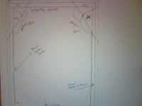
Notepad Project
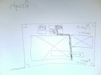
This is my rough sketch for my notepad project. I chose to focus on my photography for this project. I feel the notepad i have sketched below represents my skill as a photographer and also my simple yet unique design abilities. I feel it is important to get your ideas across simply, but without hindering the design(sloppy, messy).
The target audience is me, my photography background.
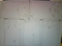
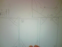
My thumbnail sketches:
Specs:
.25 margin
5 x 7 inch
Black ink only |.125 bleed
50 sheets per pad
padded
chip board back
Price per pad: 2.50 - 5 cents per page
How long will it take to create the pads: 1 day
What type of file do they need to print the pad: .indd or .pdf
Source for information
PSU printing services
Final Notepad:
My final notepad remained consistent with my rough sketch. I feel the final product turned out how I envisioned it. The thumbnails and rough sketches helped greatly to gather my ideas on paper and help prepare for the final design.
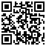
QR Code
What?
QR codes are a way to go beyond just the paper and send the user into interactive media to get a better understanding of what the QR code is representing.
Why?
Its simple. Its easy for the user to scan and arrive at a website, or any type of interactive media that oes more in depth into whatever the QR code is representing.
My QR code:
The target audience is me, my photography background.

My thumbnail sketches:


Specs:
.25 margin
5 x 7 inch
Black ink only |.125 bleed
50 sheets per pad
padded
chip board back
Price per pad: 2.50 - 5 cents per page
How long will it take to create the pads: 1 day
What type of file do they need to print the pad: .indd or .pdf
Source for information
PSU printing services
Final Notepad:
My final notepad remained consistent with my rough sketch. I feel the final product turned out how I envisioned it. The thumbnails and rough sketches helped greatly to gather my ideas on paper and help prepare for the final design.
QR Code
What?
QR codes are a way to go beyond just the paper and send the user into interactive media to get a better understanding of what the QR code is representing.
Why?
Its simple. Its easy for the user to scan and arrive at a website, or any type of interactive media that oes more in depth into whatever the QR code is representing.
My QR code:
Wednesday, September 7, 2011
Chapter 1 & 2
Chapter 1
Then & Now: Compare the roles and responsibilities of a shop (pp. 3 & 4)
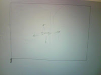
The roles and responsibilities have greatly changed. Back in the "Olden days" you would have dedicated typesetters, who generated text using phototypesetting equipment. You would have film strippers who combined line shots and color separation films from the camera to create final page film. In the old times the work flow generally looked liked the diagram below:
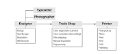
Now in the moderm times, there are no strippers or typesetters, more than half of the positions that were used back in the days are gone because of one thing: technology. The book talks about the computer, Aldus PageMaker, Adobes PostScript, and of course Adobe Photoshop.
Describe the following titles and a salary range for each:
Sales Rep/Customer Service
Estimator
Preflight technician
Prepress operator
Discuss the following key terms:
imposition
The number of images you can put on a sheet.
RIP
Raster image processor
Trapping
To create overlapping areas of common color in order to minimize gaps during slight misregistration on press.
Die Cutting
Using pressure and shaped metal dies to cut a printed piece in an interesting shape
Chapter 2
Discuss halftone dots
Since its not possible to print millions of colors in a continuous-tone fashion, the predominant printing processes approximate a wide range of colors by using CMYK printed with halftone dots.
Define the following and discuss their importance:
DPI
Dots per inch
LPI
Lines per inch
PPI
Pixels per inch
CMYK vs RGB
CMYK is used for printing, RGB is not.
Define and discuss Spot Colors
In offset printing, a spot color is any color generated by an ink (pure or mixed) that is printed using a single run
Discuss registration
Registration is the alignment of all inks printed on a press.
What is Rich Black? Why is it important?
Rich black is darker than nay other black color. Rich black is important because it can avoid trapping issues.
When discussing color management, how do you control your environment?
Make sure you stay organized and have every color from the pantone matching system.
Photos copyright "Print Production: with adobe creative suite software" by Claudia McCue
Then & Now: Compare the roles and responsibilities of a shop (pp. 3 & 4)
The roles and responsibilities have greatly changed. Back in the "Olden days" you would have dedicated typesetters, who generated text using phototypesetting equipment. You would have film strippers who combined line shots and color separation films from the camera to create final page film. In the old times the work flow generally looked liked the diagram below:

Now in the moderm times, there are no strippers or typesetters, more than half of the positions that were used back in the days are gone because of one thing: technology. The book talks about the computer, Aldus PageMaker, Adobes PostScript, and of course Adobe Photoshop.
Describe the following titles and a salary range for each:
Sales Rep/Customer Service
Estimator
Preflight technician
Prepress operator
Discuss the following key terms:
imposition
The number of images you can put on a sheet.
RIP
Raster image processor
Trapping
To create overlapping areas of common color in order to minimize gaps during slight misregistration on press.
Die Cutting
Using pressure and shaped metal dies to cut a printed piece in an interesting shape
Chapter 2
Discuss halftone dots
Since its not possible to print millions of colors in a continuous-tone fashion, the predominant printing processes approximate a wide range of colors by using CMYK printed with halftone dots.
Define the following and discuss their importance:
DPI
Dots per inch
LPI
Lines per inch
PPI
Pixels per inch
CMYK vs RGB
CMYK is used for printing, RGB is not.
Define and discuss Spot Colors
In offset printing, a spot color is any color generated by an ink (pure or mixed) that is printed using a single run
Discuss registration
Registration is the alignment of all inks printed on a press.
What is Rich Black? Why is it important?
Rich black is darker than nay other black color. Rich black is important because it can avoid trapping issues.
When discussing color management, how do you control your environment?
Make sure you stay organized and have every color from the pantone matching system.
Photos copyright "Print Production: with adobe creative suite software" by Claudia McCue
Monday, May 9, 2011
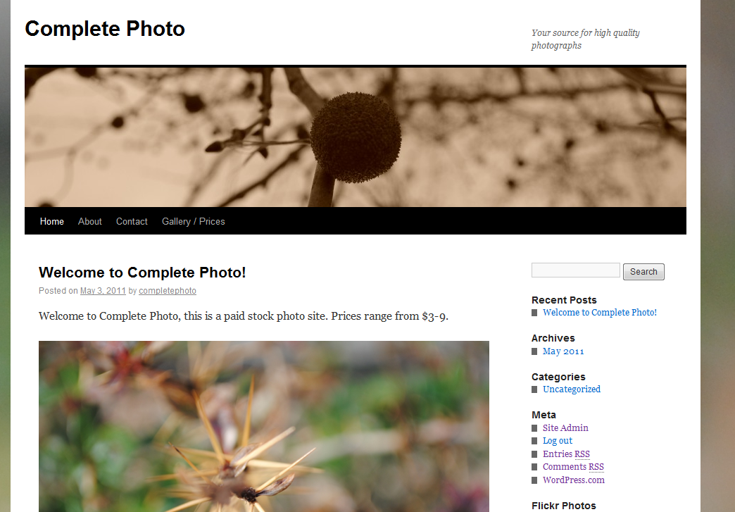
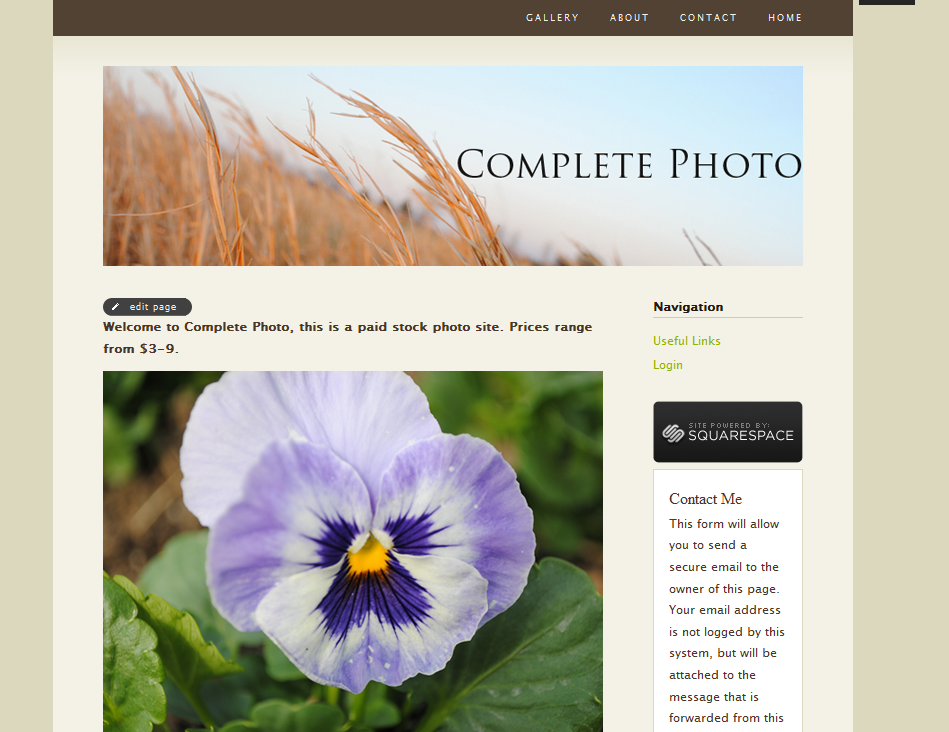
Final Site
My final wordpress site is a paid stock photo site. I named it "completephoto" and set the prices between 3 to 8 dollars. This is an imaginary site designed for my web design final project.
http://completephoto.wordpress.com/

I based my squarespace site off of my wordpress site:
http://completephoto.squarespace.com/

Finally, my customer blog which focuses on the sports car Lamborghini:

http://completephoto.wordpress.com/
I based my squarespace site off of my wordpress site:
http://completephoto.squarespace.com/
Finally, my customer blog which focuses on the sports car Lamborghini:

Thursday, April 7, 2011
Team Site
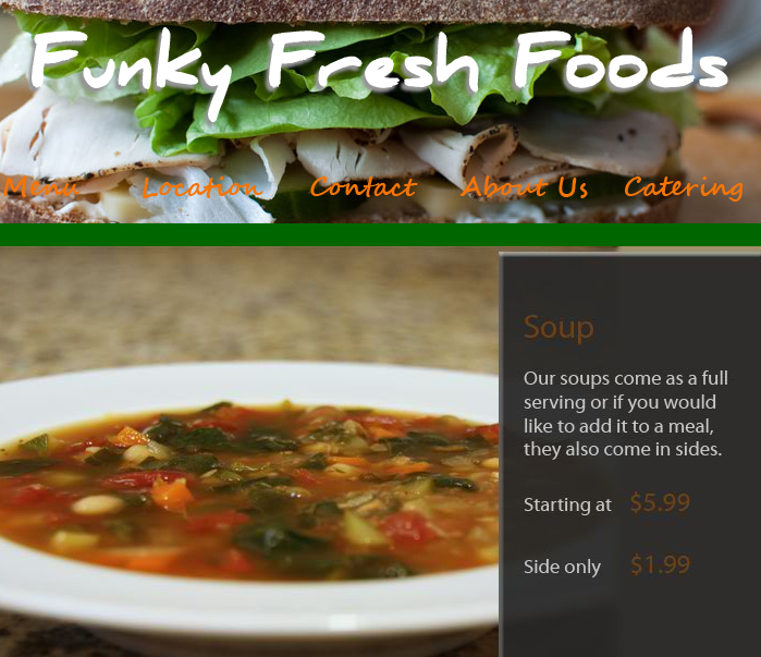
My work with Funky Fresh involved preparing content for the site. While working on this site I learned things about working with clients, and the road bumps you come across during the process. I learned you have to have a good client interview so you can get the site as close as possible to what they want, because the client doesn't always think of stuff you might think of.
I would like to learn more about dreamweaver, because my role in this project di dnot involve working much with the program.
Tuesday, April 5, 2011
Inspiration
I created this logo for a friend who is opening up their own vet clinic. This was also a project for my graphic design class. I was inspired by the KSU Vet logo to create the one i have.
Thursday, March 31, 2011
Starbucks logo change
Recently Starbucks changed their logo. This is the first logo change since 1987. The main difference between the 1987 logo and 2011 logo is lack of text, and color of the long haired girl. I would say overall this was a successful logo change. I believe the main purpose was to de-clutter the logo and make it look more sleek and professional.
Source for image: http://www.psfk.com/
Tuesday, March 22, 2011
Wordpress vs. Blogger


Wordpress and blogger are blogs, of course.
Blogger seems to have more of a personal and informal feel, while Wordpress feels like a more formal and professionl blog, something you might use for the workplace. Blogger, being more informal, is something you would use for more personal reasons.
Thursday, March 10, 2011
Second Blog!

I designed this logo in my graphic design class. This logo is for a friend who is opening up a vet clinic, his main focus is large animal.
Tuesday, March 8, 2011

Subscribe to:
Posts (Atom)